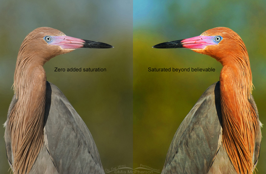
 Reddish Egret portrait comparison
In bird photography there is such a thing as over processing mistakes and the mistake I see most often is adding way too much saturation. So much so that the birds don’t look like they do in real life and sometimes to the point of looking like cartoon caricatures rather than a flesh, blood and feathered bird.
Some people do this to add “pop” to their images and on line, especially on Facebook, those images with “pop” get lots of likes and comments from people who might not know what those birds actually look like in real life.
A few times this past week I have seen photos posted to Facebook groups about birds and bird photography that made my eyes want to close because they were so over processed. One was a Great Egret that had a shadow on the dorsal side of the wings that turned so blue with over processing that that photographer called it a Blue (not sure if they meant Great Blue Heron or Little Blue Heron). Why would that bother me? Because Great Egrets are white and are never blue and the birder and bird photographer in me wanted to scream.
I’ve seen Great Blue Heron images posted where the plumage is a bright royal blue. Great Blue Herons, despite having “blue” in their name are far more gray than blue and they are never, ever bright royal blue.
I’ve posted a side by side comparison of a Reddish Egret portrait, on the left side is the image processed with only a touch of sharpening, zero added saturation. On the right side I added lots of saturation. The left side may “pop” because it is more colorful but in reality Reddish Egrets do not look like that. At all. And the colors in the background wouldn’t either.
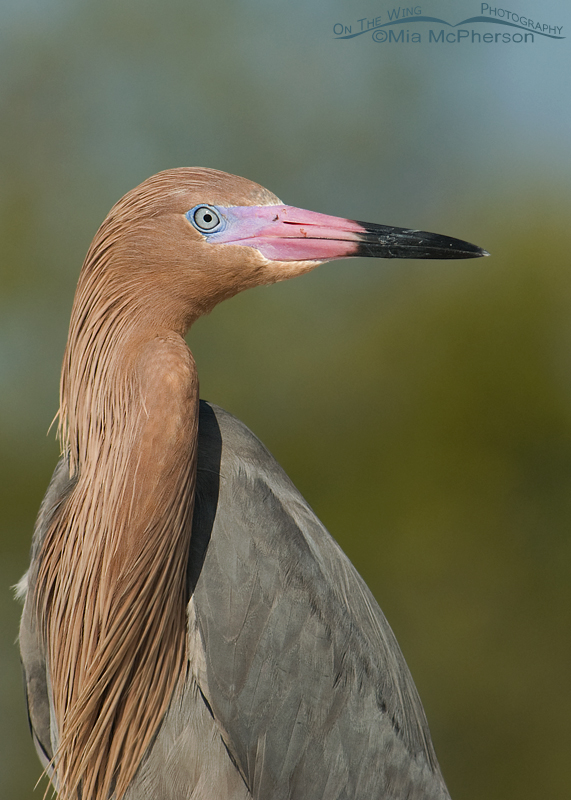 Reddish Egret portrait
This is what they look like. This Reddish Egret is in breeding plumage and their facial features are a bit more colorful at that time. Their lores and bills are more vibrant in breeding plumage but they are not as bright as the over saturated comparison above.
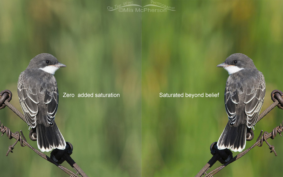 Juvenile Eastern Kingbird comparison
I also wanted to add a side by side comparison of a basically black and white bird so I picked this juvenile Eastern Kingbird. On the left there is zero added saturation and on the right too much saturation. Adding saturation generally doesn’t affect blacks and whites in images but as you can see it did affect the greens and tans of the vegetation behind the kingbird.
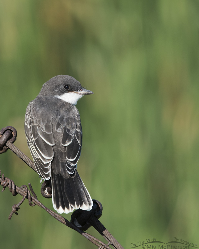 Juvenile Eastern Kingbird at Farmington Bay WMA
Now those background colors aren’t too far from what they looked like straight out of the camera but I truthfully prefer this version that isn’t over saturated.
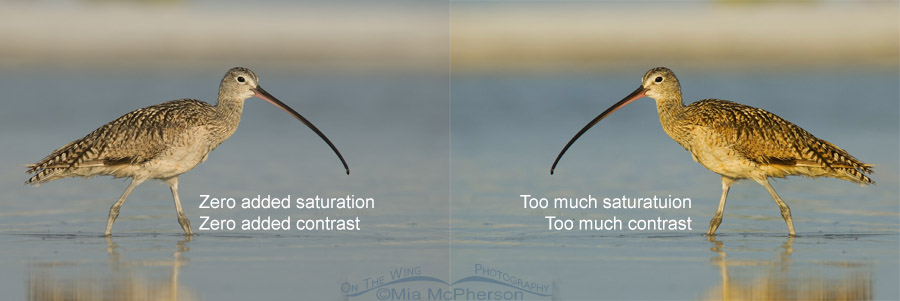 Long-billed Curlew comparison
Some people also add too much contrast along with too much saturation in post processing and that can also make the images “pop” but those images generally don’t look realistic either.
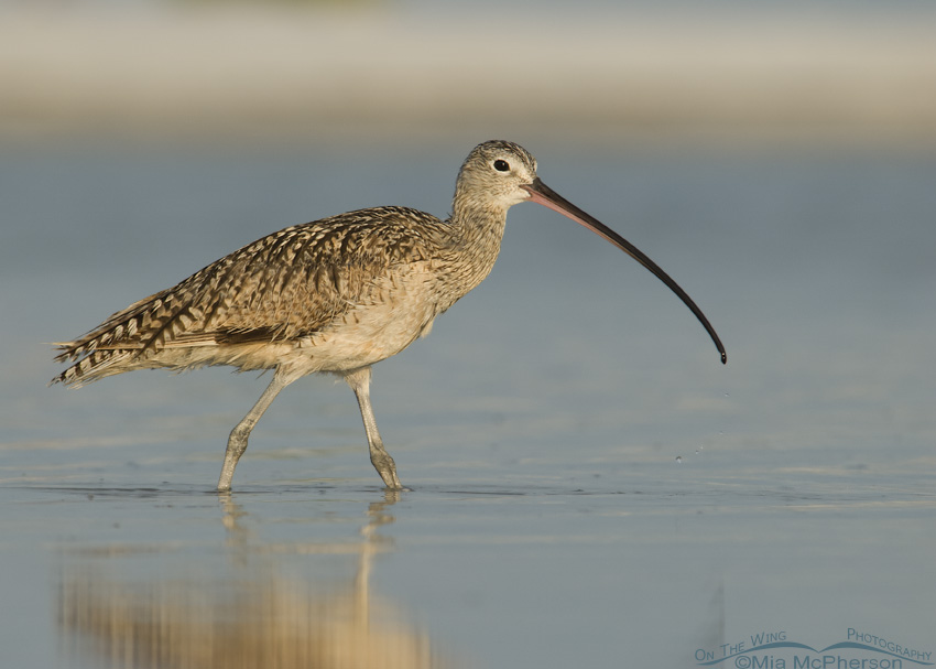 Long-billed Curlew walking in a shallow lagoon
When I process my images I do so with a light hand. I have seen too many images where the saturation and contrast levels were terribly overdone and the birds end up looking like cartoon caricatures because the colors are unrealistic. I prefer to leave my images as close as possible to what they looked like when created, using only minimal contrast, saturation or levels adjustments along with sharpening for web presentation.
If the person is going for artistic appeal by using filter and textures and adding lots of color & saturation that is completely different, that is photo art not bird photography.
Also, some people may select the “Vivid” color setting in their camera which results in super highly saturated images but they don’t necessarily look like what the bird did at the time the image was taken. I would suggest never using that “vivid” color setting for birds or wildlife for that matter because the resulting images will not look natural.
I know I have ranted a bit but honestly I have been seriously contemplating leaving some of the Birder and Bird Photography groups on Facebook where you are not allowed to “critique” the images. Just this week I saw someone offer help to another photographer by critiquing another photographer’s image in one of those groups and they got slammed for the critique by several members and then they left the group.
Their advice to the other person on their image was spot on in my opinion.
My advice is to go easy on adding saturation in bird photography to avoid over processing mistakes.
Life is good.
Mia


Hope you don’t mind that I shared this excellent blog on my own FB page. I live on the Texas coast and the Roseate Spoonbills are just starting to court and breed. My eyes hurt looking at some of the photos posted on Birds of Texas. The spoonbills are extremely colorful and need no help from post-processing. I am by no means a purist SOOC gal as some good images can be improved by a bit of contrast or slight adjustment with ACR, but why anyone would like a Pepto-Bismol pink bird against a brilliant blue sky is beyond me.
I could not agree more. I am so tired of over saturated over processed photos. The only things I adjust on my photos are to straighten the horizon and crop to an appealing composition.
I am in hearty agreement with the overuse of saturation and/or contrast. Nature/natural photos shouldn’t need it…or only minimally. However, I do have a thought about why some photos get over-processed. Could it be because of some visual difficulties of the person? I know that when my grandmother (an artist) had cataracts removed, the use of color in her paintings was a lot different. She said that she could see colors again! Could it be that a person that has cataracts (and maybe doesn’t know it) simply cannot see the colors that are already there, and they add the color (or over add the color) in an effort to make it look better in their eyes??? I don’t really know, but it’s just my theory for some folks.
I am like you…cropping, sharpening and maybe getting rid of some shadows are all that I like to do with my photos. Any more than that simply takes too much time for me, and takes the fun out of photography. I would much rather be out shooting and NOT be a slave to my computer!
Thanks for your thoughtful insight.
Sometimes I wonder if people’s monitors are off on color balance and it effects the finished results on a correctly calibrated screen.
Interesting post and great work with the example images. If it’s in an art show, OK. But I prefer to see reality.
Mia……I agree. A very light touch is best. I do sharpen almost every photo a bit. What are your thoughts on sharpening?
Natural is good.
Mia–now you’ve got me wondering–if particular politician is actually as orange as he appears or if he has merely been overprocessed and oversaturated…it’s a puzzlement…
Thanks for your post on over-processing, Mia! This has been a pet peeve of mine since the earliest days of digital processing. I agree that if an image is produced for ‘artistic’ purposes, it is ‘maker’s choice’, but anything featuring natural scenes, flora and fauna deserve true rendition. I have routinely assume that over-processed images are the work of amateurs and hobbyists. But what bothers me most now is that even some photography magazines feature over-processed images …
Great comments on processing! Should full disclosure on processing be required on all photos?
I agree with you! Natural looking photos are the best.
Thanks for the education and for keeping your images “real.”
One reason your blog is so appealing to me is that you honor, record, and present the birds as they are. I’d rather bring home and post one decent photo from a trip than use processing to correct my mistakes. It’s not been easy, learning the skills, but every now and then, I bring home two decent photos — and that’s a real pleasure.